Controversial 2020 Tokyo Olympics Logo History and Its Meanings
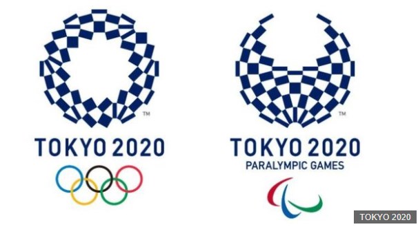
On 25 April 2016, the official 2020 Tokyo Olympic Game logo has finally come out. Named as Harmonized Chequered Emblem, Asao Tokolo's design stands out among near 15 thousands of works in the re-opened contest for Olympic logo designs.

Image: https://www.bbc.com
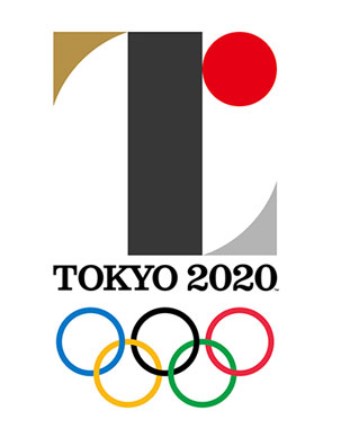
Make a Free LogoThe first official logo was launched in July 2015. Designed by Kenjiro Sano, it incorporates a "T" for Tokyo and a red sun of the Japanese flag. Despite the fact that people once loved it, it was charged by a Belgian designer Olivier Debie for plagiarism and got replaced soon.

Image: https://www.bbc.com
2020 Olympics Logo Meanings
The official 2020 Olympics logo is comprised of indigo blue chequered patterns. The traditional color represents elegance and sophistication of Japan. The chequered pattern itself symbolizes different countries, ways of thinking, coinciding Olympic's idea of being a platform that promotes diversity.
Other Designs
If you search 2020 Olympics logo, you will see a logo rank the first.

Image: 2020 Other Popular Olympic Logo Design
Follow our guide to watermark photos with your logo.
Also Read: How to Choose the Best Fonts for Your Logo >
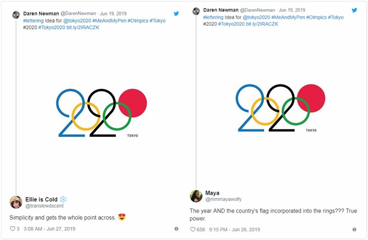
This is also one of the works of 2020 Olympic logo. It incorporates the existing Olympic logo with the year of 2020. The "0" at the right that looks like a disk, symbolizing the sun design in the Japanese flag. At the first glimpse of the logo, you can tell what it represents.
People prise for its creativity and simplicity.

Image: Comments on 2020 Other Popular Olympic Logo Design
It is a huge regret that this logo wasn't chosen as the official logo of 2020 Olympic Games.
We don't really know the exact reason. Only one guy pointed out that there might be some legal issues with the design.
The Bottom Line
The finalized 2020 Olympic logo may not be perfect, and other logos may have merits. Designing works are the hardest thing to judge. Anyway, let's respect the result and look forward to the Olympics.
Make a Free Logo


