Ugly Logo Analysis - How To Fix A Bad Logo Design?
Forewords: Let's study and appreciate world top 3 ugly logo designs! What makes them become top 3 bad logos? How to fix logos in bad design patterns? Exclusively, we've collected some imperfect design patterns that are likely to render an ugly logo in bad taste. After reading, you'll learn how to avoid designing a bad logo. Also, you'll get a variety of free cool logo ideas and easily customize a logo that you've been longing for.
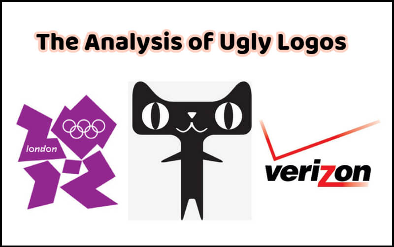
Image: The analysis of ugly logos.
Ugly logos or bad logos are almost everywhere! There is no need to collect and analyze all bad logos, since most of these logos are simply ugly for following no design principle or pattern.
But what if you know - those experienced, world top designers can also work out ugly logos in the worst looking as well? Will you be curious or surprised?
Now, let's appreciate and learn from the top 3 worst logos - 2012 London logo, Tmall logo, and Verizon logo! They shall be excellent tutorials to learn the logo design of good and bad.
Part 1 - Top 3 Worst Logos with Ugly Looking from Professional, Experienced Designers
Before studying the world top bad logos in ugly looking, we'd like to pose a question:
What is an ugly logo or a bad logo, exactly?
By searching online, we can't find a definitive answer. But a reply catches our attention - With respect to the ugly logo or bad logo, we shouldn't take "ugly" or "bad" as an oppositive word to "beautiful". It's the same meaning of "imperfect". That means, ugly logo designs are those logo works that fail in some ways to be a beautiful logo, but there will be some ways to upgrade them to be beautiful.
Grasping the definition of ugly logo and bad logo, we will take a look at world top 3 worst logo designs:
#1 Bad Logo Design Example - 2012 London Logo
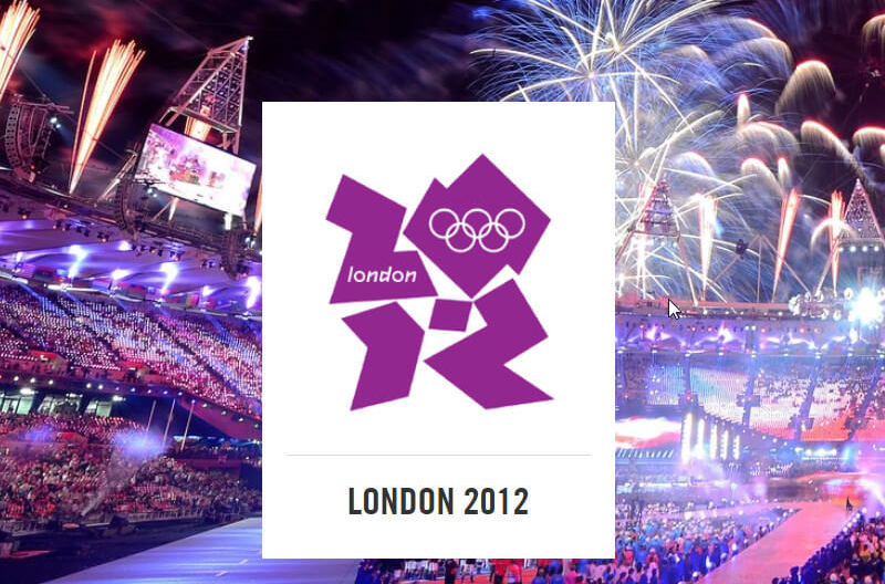
Image source: https://www.olympic.org/london-2012
Designed by a design firm Wolff Olins, 2012 London logo emphasizes the year of 2012. The odd shapes that form "2012" digits stand for all kinds of great Olympic spirits.
When we search for its meanings and look back at 2012 London logo, we get enlighted. But that's not how a logo functions! - How can a new audience recognize its meaning from 2012 odd shapes, at a glance? For real, even us can barely find those shapes mean 2012. (It could be zo>.lighting. Or, it could be Zii>.Z. Or, do these shapes remind you of Pikachu?)
2012 London logo design confuses us. We barely know what the logo wants to show us. Such a design obeys the basic logo function - communicating with audiences effortlessly.
#2 Ugly Logo Design Example - Tmall Logo
Image: Famous ugly logo design - Tmall logo
Chinese Alibaba's Tmall uses a black, strange logo. It's ugly, strange and funny, as no cat can grow like this one. It's far from the words of "adorable" or "cute". As a logo representing an online shopping platform, it fails to make people think of shopping.
Worthy to note: Some Chinese designers and celebrities think that Tmall logo is an ugly but successful design. In their eyes, Tmall logo is ugly but very impressive. People have no chance to find any cat logo uglier than this Tmall cat for a long time, so that people will remember Tmall logo.(OK, if that's their points of view on a logo!)
#3 Bad Logo Design Example - Verizon Logo
Image: Famous ugly logo design - Verizon logo
Verizon logos, especially its old logo in white background, always arouse public attentions for its ugliness. The same, we can hardly know what services Verizon provides from its logo design.
Part 2 - Where Do Ugly Logos Go Wrong?
Take a look at those ugly logos - we all know they are ugly at first sight, but what makes these logos bad technically? And, where do the ugly logos go wrong?
Usually, the reasons for an ugly logo can be analyzed from 2 main aspects - bad logo design and the wrong color.
Mainly, bad logo designs often have these points:
- a. Not a very unique design.
- When people saw a similar logo previously, it isn't be easy for audiences to distinguish your logo from piles of existed logo designs. - b. Fail to sympathize with humans.
- c. Logo font and the design style do not rhyme.
For wrong color situations, we find these bad logos have problems in these categories:
- a. Font color is too intense or fresh, while shape color is fader than font color.
- b. Use many colors.
- In most cases, professional designers suggest us using 3 different colors at most. - c. Colors don't rhyme with each other.
- d. The color feelings don't fit the logo theme or your business service.
- e. There is no primary color.
- f. Use gradient color.
- Gradient color usually demeans a logo design.
Part 3 - How to Fix A Ugly Logo Design?
Now that we've found the tips that cause your logo to be ugly and bad, let's fix the bad logos in ugly looking.
When you examine an ugly logo, checking ugly logo points listed in part 2 will make your job easier to identify what is wrong. Then, copy with the issues and come up with a better solution to turn a bad logo right.
If your case is a logo being not very unique, you may want to change your logo with a new design. We recommend the article - "Cool Logo Design Ideas You Can Use for Logo Design", and you'll have some fresh thinking about how to re-design your logo.
If you are dealing with the situation of a logo not sympathizing with humans, we suggest adding some icons or other graphical elements that are related to your services and businesses.
Or, you are facing with wrong logo color issues, no matter what it is, you can easily replace the logo colors with a proper color scheme by Adobe color palette - You are entitled to search a color scheme, or adjust the color wheel to find colors that you prefer and rhyme with each other.
Part 4 - How to Design Your Logo Easily, and Avoid a Bad Logo in Ugly Looking?
You may find logo design not easy, and the fact is it is true! You need to conceive a proper logo design, pair the design with the right colors, and examine your logo design. Even professional designers can fail in the process.
For the majority of people, they wish a straightforward logo design result, but not follow the standard logo design process. Good news is that you have DesignEvo logo maker - one of few free logo DIY services online.
DesignEvo.com offers 10,000+ stunning logo templates with different keyword tags. By search, you will find no trouble to find dozens of great logo templates for your logo design. Click in, and your wanted logo is only a few steps away. The best news, its download options cover a free logo download within the size of 500 * 500.


