Negative Space Design In Logo Design - Materials, Tips & Tricks
Forewords: This article focuses in negative space design applied in logo arts. You'll find reviews of top negative space art logos. And, you'll have the most accessible choice to make a decent negative space design online for free!
In our previous article, we've rounded up famous cool logo designs, and negative space logo design thereof as one of the most creative logo ideas. Back to this very tip, we'll go deep into negative space logo arts exclusively.
In the paragraphs below, we'll present you with negative space definition, its function, and specify what kinds of brands suit a negative space logo better. In part 2, we'll review top negative space logo designs for your inspirations. For those who need a negative space logo, we've also shared a wonderful, free logo app online, and its two easy ways available for people of all levels.
Part 1 - Negative Space Definition & Function (How It Helps Branding? When to Choose a Negative Space Logo?)
What Is The Definition for Negative Space Design?
Negative space is also named white space or empty space. And all graphics are composed of positive space and negative space - Positive space is those visual, focused graphics or objects, and negative space refers to the background and the void.
We normally pay little attention to negative space in a design, but how it's planned will largely determine whether the whole design is too crowed or comfortable for viewers.
Negative space art design is a design composition trick that uses the gaps between shapes or letters to form a different hidden image. It's much creative and requires a lot of intelligence, wisdom & work.
Negative Space Design Function - How Negative Space Designs Help Your Branding? When to Choose a Negative Space Art Logo?
In logo design, negative space art is perhaps the most brilliant design thinking:
For logo designers, they often have dilemmas when they want to display some things in their logo design, but somehow drawing them on the canvas can ruin the whole design. (Either they make logo contain too much information or cause imbalance/discordance.) And smart designers explore and find a perfect solution - negative space logo design!
Logo design principle often emphasizes simplicity over summing up all. Technically speaking for logo design, less is more, effective is king, minimalist is everything. And, negative space design helps designers abide by logo design principle - by hiding something in the negative space.
A quality logo designer needs to draw the most crucial parts with the fewest shapes, and he must try his best to ensure that all audiences can figure out the logo meaning immediately - so, the design must focus on only one thing. And, negative space design becomes a viable way to convey and demonstrate other key information to audiences!
Part 2 - Top Negative Space Logo Arts
If you have few ideas of how negative space design function in logo design, then why not take a look at those top negative space logo arts:
Mister Cooper Negative Space Logo Art - Mister Cooper chooses a lettermark logo in the shape of a sexy mouth. The ice scream brand tries playful bubble texts to compose its yummy logo. The whole logo design even reminds people of jelly.
If they only use texts with their brand name in logo design (without description words -"ice cream"- in negative space), audiences may fail to guess out what the brand is nor what their business provides. Therefore, Mister Cooper decides to imply their business - ice scream for grown-ups, between Mister and Cooper.
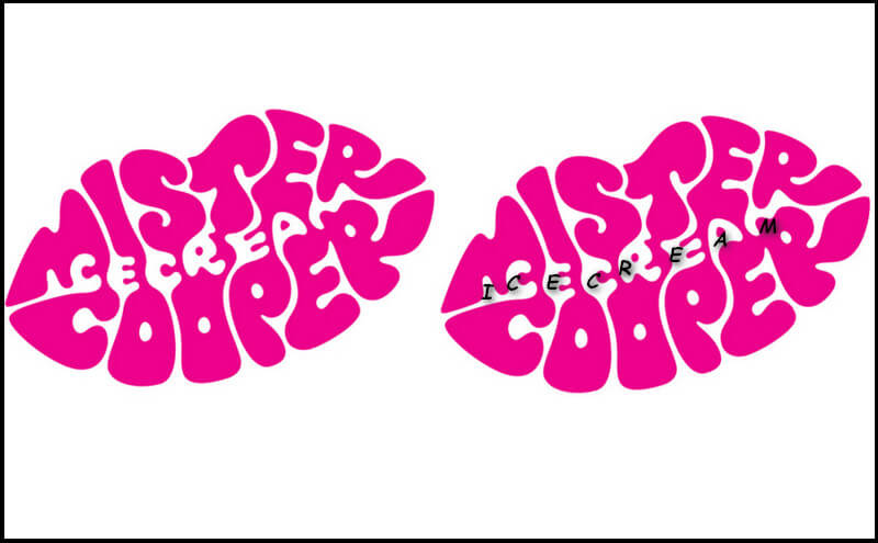
Image: Mister Cooper Negative Space Logo Design.
FedEx Negative Space Logo Art - FedEx is a courier delivery service provider. Also, they hide their information between "E" and "x": The negative space arrow pointing right implies they know the exact direction for their transport businesses, and clients can put trust in FedEx.
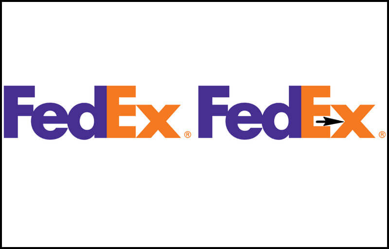
Image: FedEx Negative Space Logo Design.
NBC Negative Space Logo Design - NBC logo leaves a peacock head in the negative space. With the rest shapes, it forms an intriguing peacock, which suggests their TV contents are gorgeous.
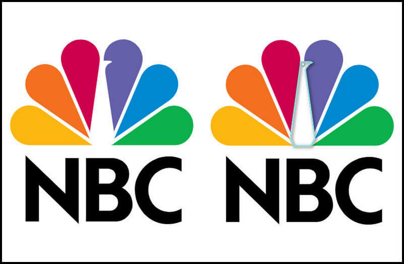
Image: NBC Negative Space Logo Design.
F1 Negative Space Logo Art - F1 sports, as the most competitive car racing game, choose a shape that looks like the racing track. Meanwhile, the shape has the feelings of "F" and "1", which reminds people of speed and F1 sports.
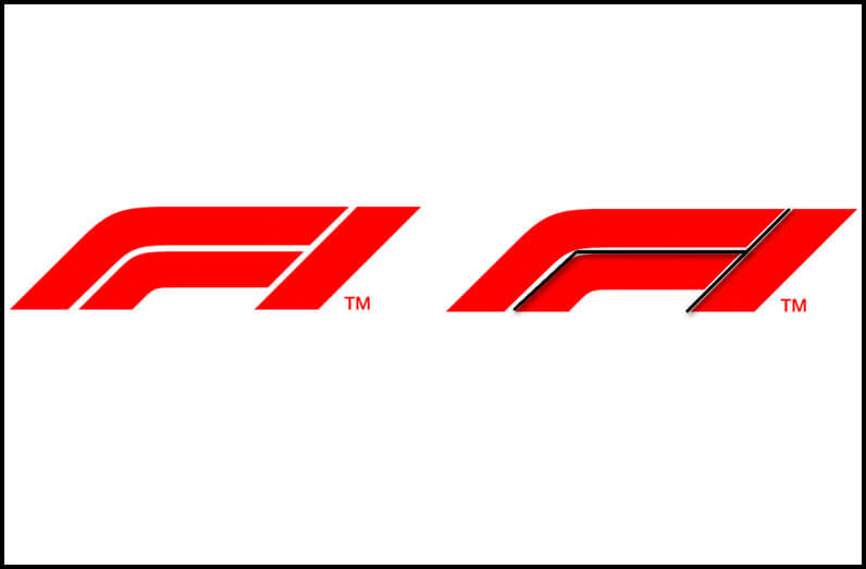
Image: F1 Negative Space Logo Art.
USA Network Negative Space Logo Art - By squeezing its letters and applying negative space in "s" letter, USA network company shares its strong connections with audiences.
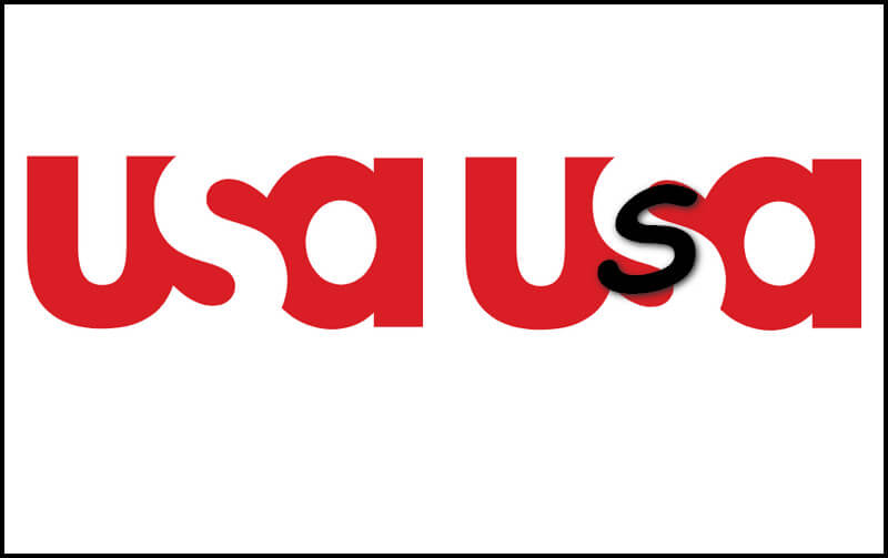
Image: USA Network Negative Space Logo Design.
WWF Negative Space Design Logo - With the help of negative space art, World Wildlife Fund logo successfully outlines a panda, which is an endangered species. The missing lines might imply the decreases of panda lives visually.
Image: WWF Negative Space Design Logo.
From the negative space arts above, we conclude that negative space designs have the meanings of entertaining, compressing, merging, connection, losing, etc.
Part 3 - How to Design a Negative Space Logo Effortlessly?
It's not easy or very obvious to use "addition" formula to form a negative space logo art. But think differently, why can't we use "subtraction" formula?
Without professional design software, like Photoshop logo maker or AI logo creator, you can still complete a negative space design online easily!
DesignEvo is a free negative space design tool with 2 methods:
a. You can take advantage of its designer-made negative space logo templates and make a custom to complete your design:
Find any of logo fonts interesting? Click it for customization & download!
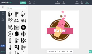
b. If you have other brilliant thoughts, then its [Start From Scratch] will present you with a blank design interface with unlimited design possibilities. Though the interface looks no different from other design tools(or perhaps it looks simpler), with it, you can finish a negative space art logo a lot faster - by the using the combo of DesignEvo's icon search feature and shape feature:
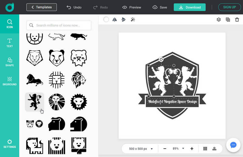
Image: Design Your Own Negative Space Design Logo from Zero in DesignEvo for Free.
If you want a shape revealing in negative space, you can drag the shape onto your main drawing and change its color to the background color. That's all!
Hope you enjoy reading negative space design in logo arts, today! Have fun by innovating negative space design logo!


